Saturday, September 5, 2009

"The Historic Collection" by Neil Young

Neil Young is one of these artists I strongly dislike (and I'm being polite). But somehow he must be interesting enough to take care of. I did a funny makeover by choosing pictures in different styles from Google (if you disapprove, tell me), and by creating a completely different style...
Like, for example, how would a Neil Young cover look like if he played different styles of music - different from the boring, wining what-do-you-call-it he played in the past years?
If he were young in the eighties, and he would've played britpop, his record sleeves could've looked like the first one. But if he were a jazz gitarist his record sleeve might look like the second one. And if he were a kind of a Mark Knopfler in the eigties his CD booklet would contain pink. But if he would know what went on in New York nowadays he might look like the guys from Fleet Foxes (including beard and shabby clothes).
Which one do you prefer?

Labels:

Friday, April 3, 2009

"Greatest Hits" by Celine Dion

I consider the Canadian singer Celine Dion to be one of the dullest artists ever. Of course you don't have to share my opinion but try to see a driven, modern and energetic artist in this (existing) little sleeve. You'll need a lot of imagination...

So I tried to pimp miss Dion's style. After all this blog is about fake covers.

    ...what would a record sleeve look like if she was an r'n'b singer? Would her Greatest Hits album be simular to the first picture on the left? Maybe she would even translate the album title into her mother tongue French.
But what if Celine Dion were a rock artist? Would she wear attractive red dresses and act more outspoken and lively? Like on the top right cover...
It doesn't take a lot of effort to image her as a country artist with an appropriate styling, like on the third cover.
But I think I would like her most as a soul artist...


What's your opinion?
Do you think she would be a convincing gothic singer or a hot tempered salsa star?

Labels:

Saturday, March 28, 2009

"No line on the horizon" by U2

I agree... U2 is not a fake band (although some people think differently :-) ). But the reason why I wrote this post is because the new U2 album has probably the dullest cover ever.
Is that a crime? I wouldn't say that. But it's clear that we've seen that picture somewhere before...  

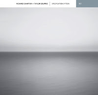
The cover for the new U2 album uses the same photo by Hiroshi Sugimoto that was used by electronic/ambient musician Taylor Deupree for his CD "Specification.Fifteen" (based on Sugimoto's work) from 2006.
You can read all about it here.

Without using the words stealing or plagiarism I would say that's not very smart. Who's to blame? I wouldn't know. Sugimoto himself, or his management? U2, or their management? This will probably stay an ongoing discussion...

Fact is, that it is a dull cover.
So I tried to pimp it (fake covers again!) but I kept the black&white picture. I didn't use any bigger-than-life typography and I didn't add any graphical elements.


Did it get any better? Tell me.

And that brings me to a second subject about U2.
The U2 album sleeves look always a bit simular. (Let's make an exception for "Pop") You could call that a house style but I don't think it's intentional. There's never any great design. Never any creativity. Always pale brown, dark red and black&white. Always a bit symmetrical. Always a bit old fashioned. I'ld almost say: always a bit dull.
What would happen if U2 used the same dull photo and the cliche title of their last album, but if they'ld use an old design?


I bet you recognize the albums in an instant...

"No line on the horizon" by U2

Labels: