I agree...
). But the reason why I wrote this post is because the new
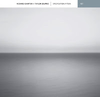
album has probably the dullest cover ever.
Is that a crime? I wouldn't say that. But it's clear that we've seen that picture somewhere before...

The cover for the new U2 album uses the same photo by Hiroshi Sugimoto that was used by electronic/ambient musician
Taylor Deupree for his CD "Specification.Fifteen" (based on Sugimoto's work) from 2006.
You can read all about it
here.
Without using the words
stealing or
plagiarism I would say that's not very smart. Who's to blame? I wouldn't know. Sugimoto himself, or his management? U2, or their management? This will probably stay an ongoing discussion...
Fact is, that it is a dull cover.
So I tried to pimp it (fake covers again!) but I kept the black&white picture. I didn't use any
bigger-than-life typography and I didn't add any graphical elements.

Did it get any better? Tell me.
And that brings me to a second subject about U2.
The U2 album sleeves look always a bit simular. (Let's make an exception for "Pop") You could call that a
house style but I don't think it's intentional. There's never any great design. Never any creativity. Always
pale brown,
dark red and
black&white. Always a bit symmetrical. Always a bit old fashioned. I'ld almost say: always a bit dull.
What would happen if U2 used the same dull photo and the
cliche title of their last album, but if they'ld use an old design?
 Names like Grandmaster Flash, Run DMC, Whodini and The 2 Live Crew must still ring a bell to you. They will be remembered for their legendary singles, their breakdance moves and their streetwear. Wests Tigers though had the same bad luck as The Rocksteady Crew: one big chartbuster, and then end of career. Wests Tigers never even made an album after their megahit "What their is of it" (I bet you still have the "Yo Yo Yo"-yell in the back of your head!).

 The cover for the new U2 album uses the same photo by Hiroshi Sugimoto that was used by electronic/ambient musician


